Hello World
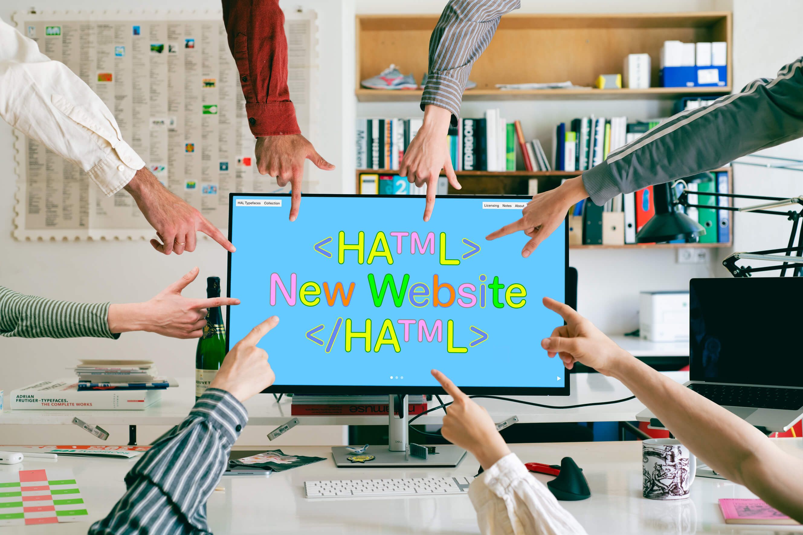
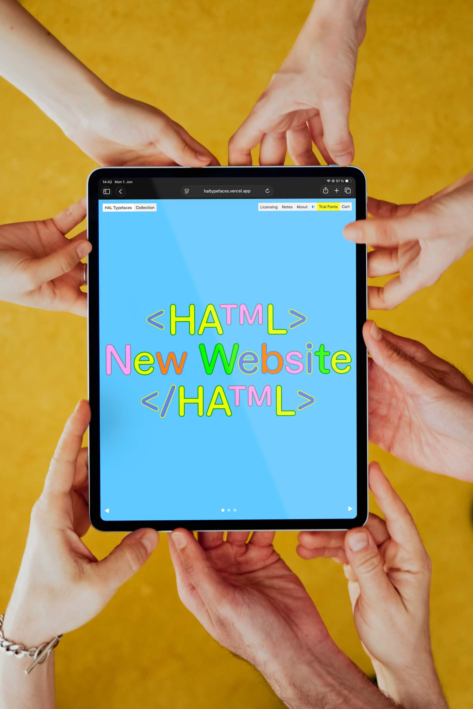
After four years of running HAL Typefaces, we’re proud to finally reveal the foundry’s new, second website. It’s not just better, smoother and faster, but also more functional, more efficient and (most importantly) more fun to use. Keep reading below and I’ll briefly guide you through the updates as well as share some background information on its development.
Looking back, I remember visiting David Bennewith’s website during my graphic design studies and being amused by the witty <title> tag. It recently came to mind and I was delighted to see it’s still intact to this day. It reads:
Countries have websites,
towns have websites,
buildings have websites,
companies have websites,
you have a website,
I have a website.
Type foundries have websites, too. And they’re so much more than a portfolio of fonts. Digital type foundries are essentially software firms, selling virtual goods: an array of countless coordinates, coded to display glyphs and symbols on screens. The website is the hub: the specimen and the tester, the vendor and point of sale. If that’s not enough, it also has to look damn good. The website expresses, transports and mediates the foundry’s aesthetic values. It’s a shop window, an art gallery and a glossy trade magazine all in one. Independent type foundries, which licence their typefaces via one source and one source only, are in fact dependent on a reliable online store and a well-programmed website.
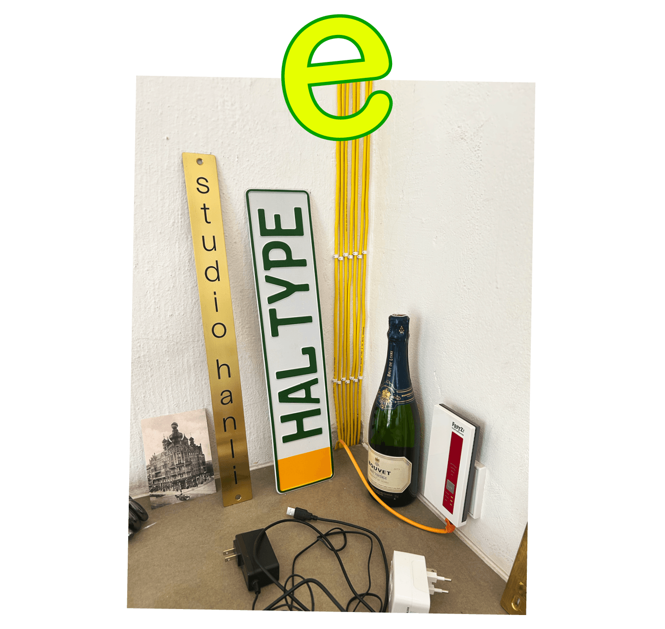
When the foundry was launched in 2022, we were sitting in a space that was once a warehouse for old and broken televisions. It was dusty and cold; the antique, industrial heaters had long stopped working. From there, we published a self-built site on a subdomain of our studio site. It ran on Wordpress and Lay Theme with Fontdue power-housing the shop and font integration. This DIY approach served us well, especially in the humble, early days when the budget couldn’t afford a developer. That said, this method also bears its restraints, limited by the digital parameters of prefab systems (the usual spiel of pros and cons).
As the foundry gained traction, we soon realised a custom-built website (constructed from scratch) is necessary to fit our needs without any restrictions or technical work-arounds. From the start of this process, the vision was not to completely redesign the website and foundry’s online aesthetics. Happy with the general look, it was more about updating the vibe and improving the site’s experience, making it easier and more enjoyable to browse and test typefaces, while simultaneously adding slickness and responsiveness.
Hence, we teamed up with Alejandro Ample, a Berlin-based graphic designer, developer and educator from València, Spain. Starting with Kirby and ending with Sanity as our CMS, Alejandro turned the blueprint into reality. We are grateful for his patience, endurance and understanding, especially in those few back-peddling moments. Sometimes Figma still won’t help to entirely escape the occasional trial and error heuristics. Naturally, we also stuck with Fontdue, which remains to be an extremely useful tool for type foundries. Thanks to Tom Conroy for offering continued support and improving the service along the way.
So what’s new on the new website? A major update is the use of Lotties. These are vector graphic animations, basically JSON files running an SVG slideshow. They entered the scene roughly ten years ago and are very efficient for typographic animations. Avoiding rasterisation and heavy video files, they are small in size, perfect for crisp display of fonts in motion and help to reduce bandwidth. It’s a win-win [wink]. We use them for the covers of the typefaces and notes on the landing page. Thanks to Samara Keller for kickstarting that engine for us.
We’ve included an overview page called Collection which allows you to glance at (and filter, if needed) the whole catalog at once. There are far improved newsletter sign-up forms and a Licensing page with a comprehensive FAQ section. The typeface pages have been massively improved with more fluid, custom-built type testers, glyphs overview, display of special features and fonts-in-use samples. You can now search in the list of supported languages.
Also, with the contrast symbol in the menu, you can invert and change colors in four different modes: original, inverted, greyscale, grayscale inverted. And the notes, like the one you’re reading right now, are presented collectively on their own page. Btw, thank you for making it to the end. You deserve a ★. So, if you haven’t done so already, please enjoy browsing, surfing, reading, typing, clicking and endlessly scrolling up and down our new pages on haltypefaces.com.
Ttyl g2g
Lucas, HAL Typefaces